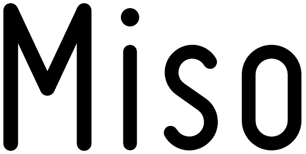
Miso
0
Miso was designed for architects' drawings. It’s a clean and narrow typeface suitable for small text but also for headlines and logos. The spacing of Miso follows the logic of mono-stroke fonts as found in CAD software. The starting point for this...
Styles
Miso

Miso Skinny

Miso Bold

Miso Chunky

Miso Light

License
Miso by Mårten Nettelbladt is sold/licensed through myfonts.com. See the license on the My Fonts website for more information.
Editors
Do the tags or description need some work? Propose an edit and earn rep.
